App, Website and Experience Design
Sketch / Design / Prototype / Repeat
I design products with the user in mind which they call UI/UX. I was featured in The Top 10 Product Design Lessons for 2016 back in the day but things change so fast, so I adapt. I've worked with large fortune 500 companies such as American Express and Fedex as well as successfel tech startups such as Lifelock and even some failed startups that unfortunately didn't make it but that has set me up to adapt to anything at this stage in my career. I am also remote friendly and work well with distributed teams, so I'll come to where ever your office is anywhere in the world if needed.
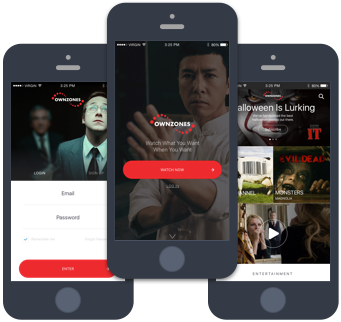
Ownzones Media
Contributions: Product Management and Strategy
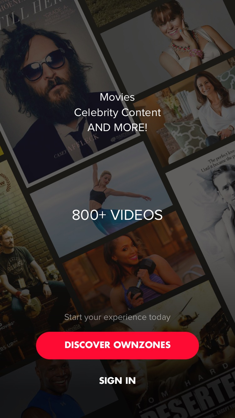
Ownzones is a startup based out of LA looking to disrupt the OTT space. I managed a team of desingers and developers through bi-weekly sprints, introduced and established new features and functionality that pushed the boundaries of innovation in the OTT space as a whole. I managed the mobile app, Apple TV app, a Roku TV app and Android TV app. In it's most recent state the company has shifted into focusing on providing a more service based decoding system since I've left.
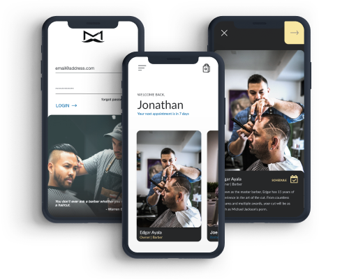
The Manner Barbershop
Designer / Developer • Designed in Adobe XD
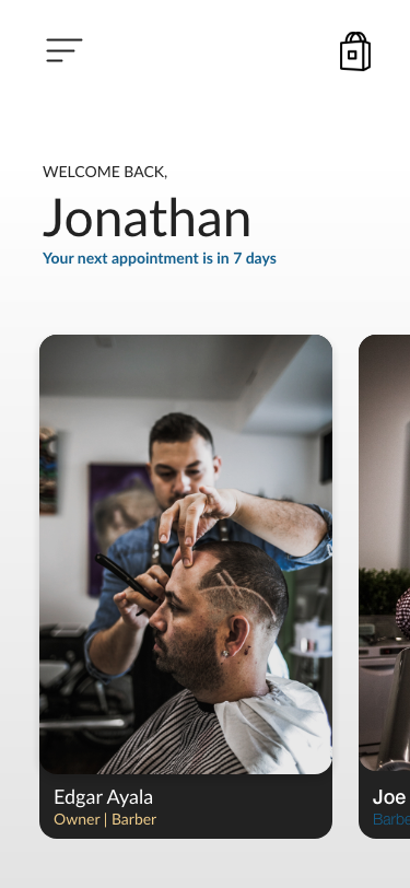
This micro-app was a part of a campaign built to give users an easy way of choosing a barber at The Manner Barbershop. The vibe at the manner is very stylish, fun and visual so the app needed to match the experience of what you would experience at the shop. Quickly cycle through each barber to see their specialties and bio before you choose who to book with. You'll get a quick view in to their calendar and be linked to their scheduler stragight from this micro-app. I also included a mobile version of their shop that is linked to their online store for an easy way to purchase swag straight from the app.
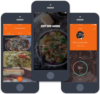
Off The Menu
Designer / Owner
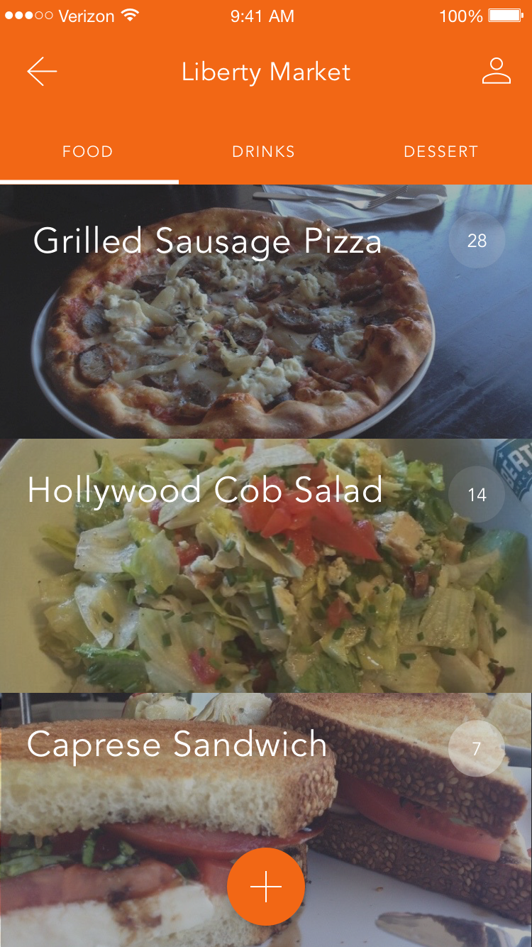
Ever go to a restaurant not knowing exactly what you're going to get and have to go off speculation alone? Well in comes Off The Menu providing you with pictures additional details, ratings and hidden tips that you won't find on your traditional menu. Think of it as a menu buddy. Something sounds good but you just need a little bit more to convince you. This concept I designed was to help solve just that. My partner and I are still looking for a developer to build out our MVP but in the grand scheme of things this may be the answer to those problems.
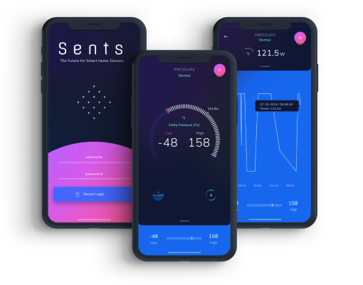
Smart Sensor App
Lead Product Designer • Designed in Figma
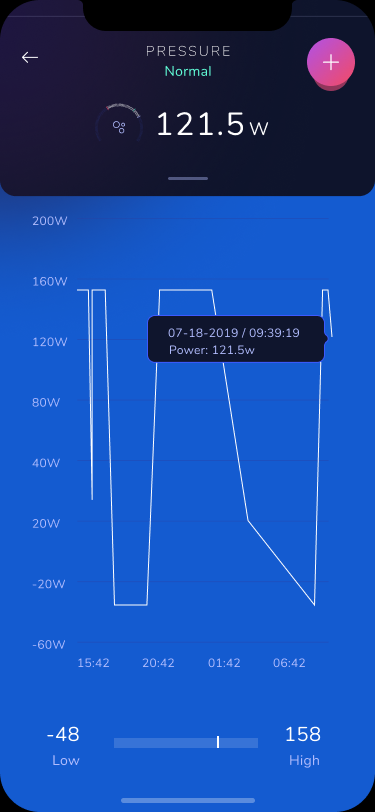
The name of this was changed as this app has not been released yet but to generalize, I am designing an app that works with a sensor that reads and collects data for your HVAC unit. The goal here is to give a propoerty manager a view in to some of the technical data output that informs a user when their air filter needs changed and also to monitor the life-cycle of their HVAC unit.
Prototype coming soon.
Collaborative Community
Product Manager / Designer • Designed in Sketch
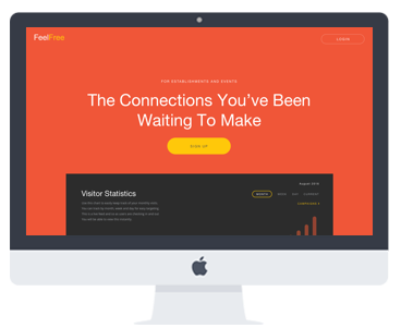
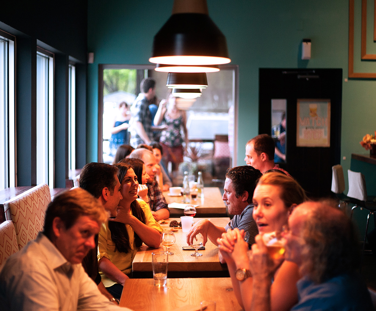
Ever feel like you met someone before but couldn't quite place them? Well Feel Free offered a solution to that amongst many others that brought people together within collaborative spaces by uniquely connecting an individual to not only other individuals but also the business itself. This particular piece of a much larger product offering connect the business with a user by allowing the business to directly interact with their customers offering unique campaigns that you wouldn't otherwise have without being apart of the Feel Free Community.
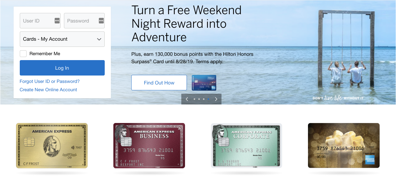
Credit Card Management
Senior UI/UX Designer • Designed in Sketch
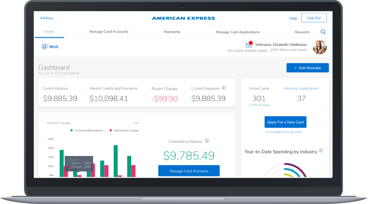
Millions use AMEX corporate business cards and such servicing the amount of people that are needing to quickly pay off credit cards, check balances and get insights into company spending. The complexity around building experiences for long-time customers who expect things a certain way and are slow to drastic changes that disrupt their pre-determined flow and process is a very tricky thing to deal with. It is one of the most challenging things as a UX designer, more than coming up with a completely new system because you are not trying to disrupt but improve even though it's easy to get use to bad ux if you have just figured out a way to cope and do what works for you. I've written a case study for this project hightlighting some of the challenges.

